Graph Examples
Introduction
This chapter provides an overview of graph configuration and visualization capabilities within the platform. It explains the available widget types, configuration parameters, and customization options, illustrated with practical use cases. The goal is to guide users in creating effective visual representations of objects, connections, and statistical data for enhanced monitoring and analysis.
Widget Types for Visualization
Several widget types are available for visualizing objects and statistics in graphical form:
- Graph – enables the creation of nodes and edges with automatic grid alignment.
- Graph on Map – similar to Graph, but with a geographic map as the background and support for latitude/longitude positioning of selected objects.
- Map – displays objects on a map, without the option to create edges (lines between objects).
Data Options in Graph Configuration
When configuring graphs, the following data options are available:
- Stream – the primary source of statistical data. Typically, a timestamp-based source should be used. Netflow streams are particularly useful for visualizing connections between clients and servers but are recommended only for shorter time ranges.
- Alternative Streams – additional data sources that can be incorporated into the graph.
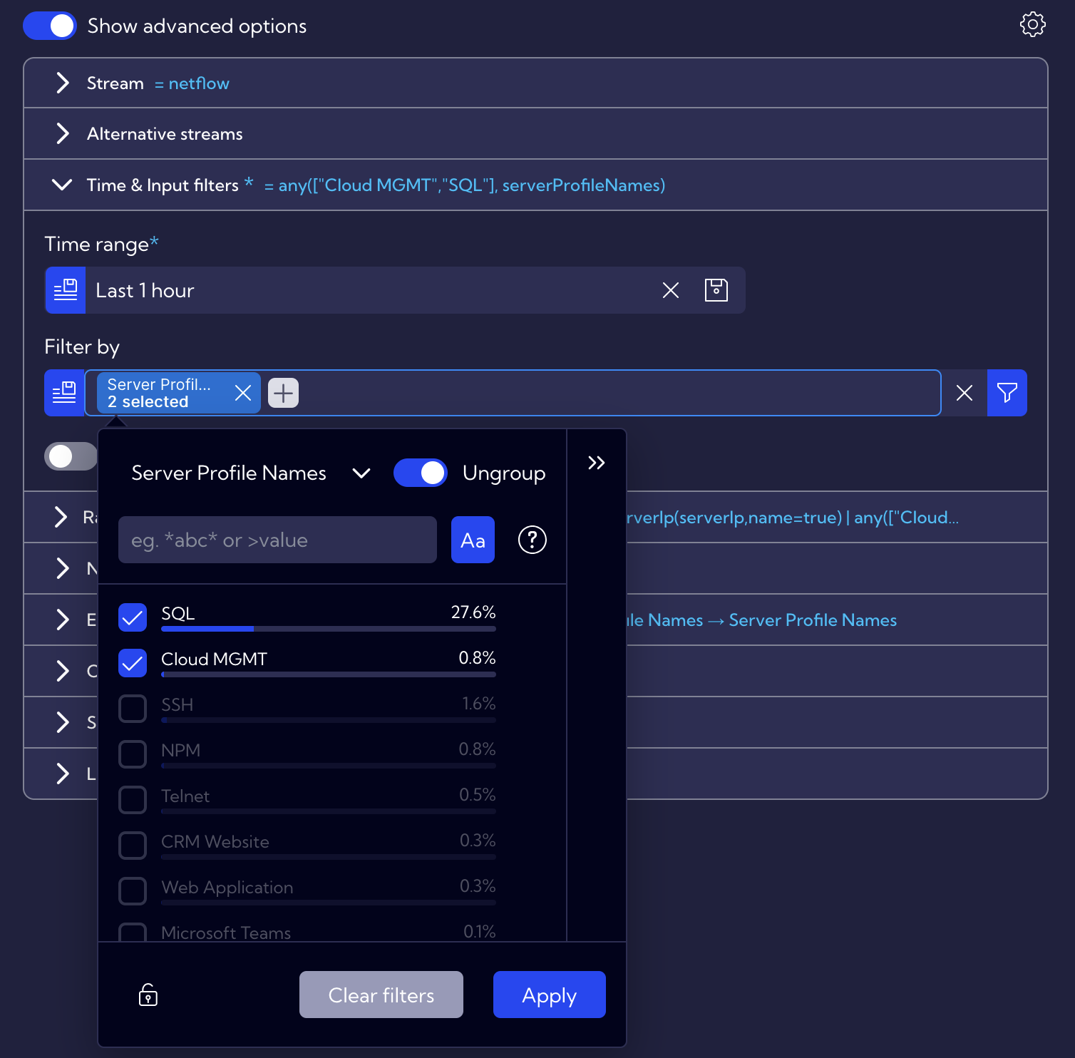
- Time & Input Filters – define the default time range and apply optional filters (e.g., applicationName = SQL). Note that dashboard-level filters and time ranges override or extend these settings.
- Raw Queries – advanced option to edit raw NQL queries or create collectors for storing query results.
- Nodes – dynamic objects in the graph (e.g., Client IP, Server IP, Subnet Name, Application Name).
- Edges – lines connecting nodes that represent statistics such as bandwidth (bits/s), sessions, or other numerical values.
- Output Filter – optional filters applied after the initial dataset is retrieved.
- Sorting & Limit – allows data sorting and restriction to a defined number of results.
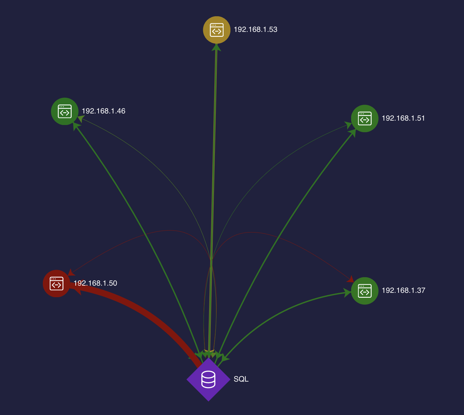
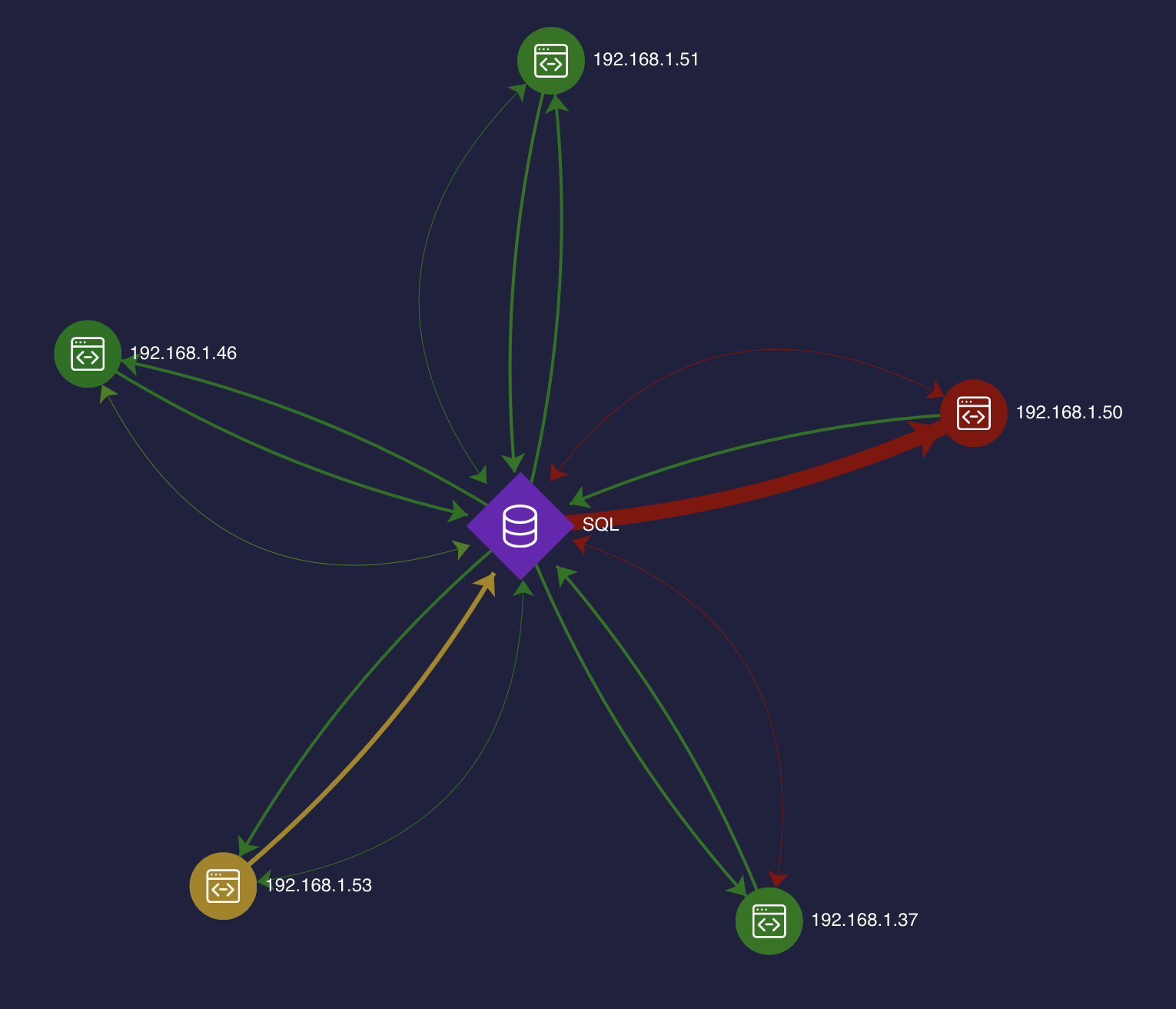
Example: SQL Server and Clients
The graph below illustrates SQL Server connections with all associated clients. The visualization includes both bandwidth utilization and the number of sessions.
This graph is based on a netflow stream with an additional filter applicationName = "SQL".
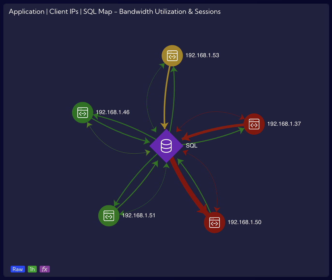
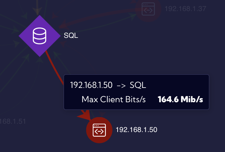
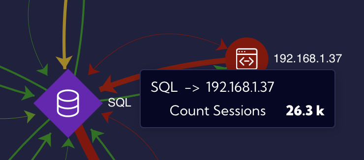
When hovering over a connection between nodes, the user can immediately identify why a specific edge appears in red (e.g., Max Client Bits/s exceeding a defined threshold).
An additional edge has been configured to present the number of sessions, providing valuable insights into SQL application traffic.
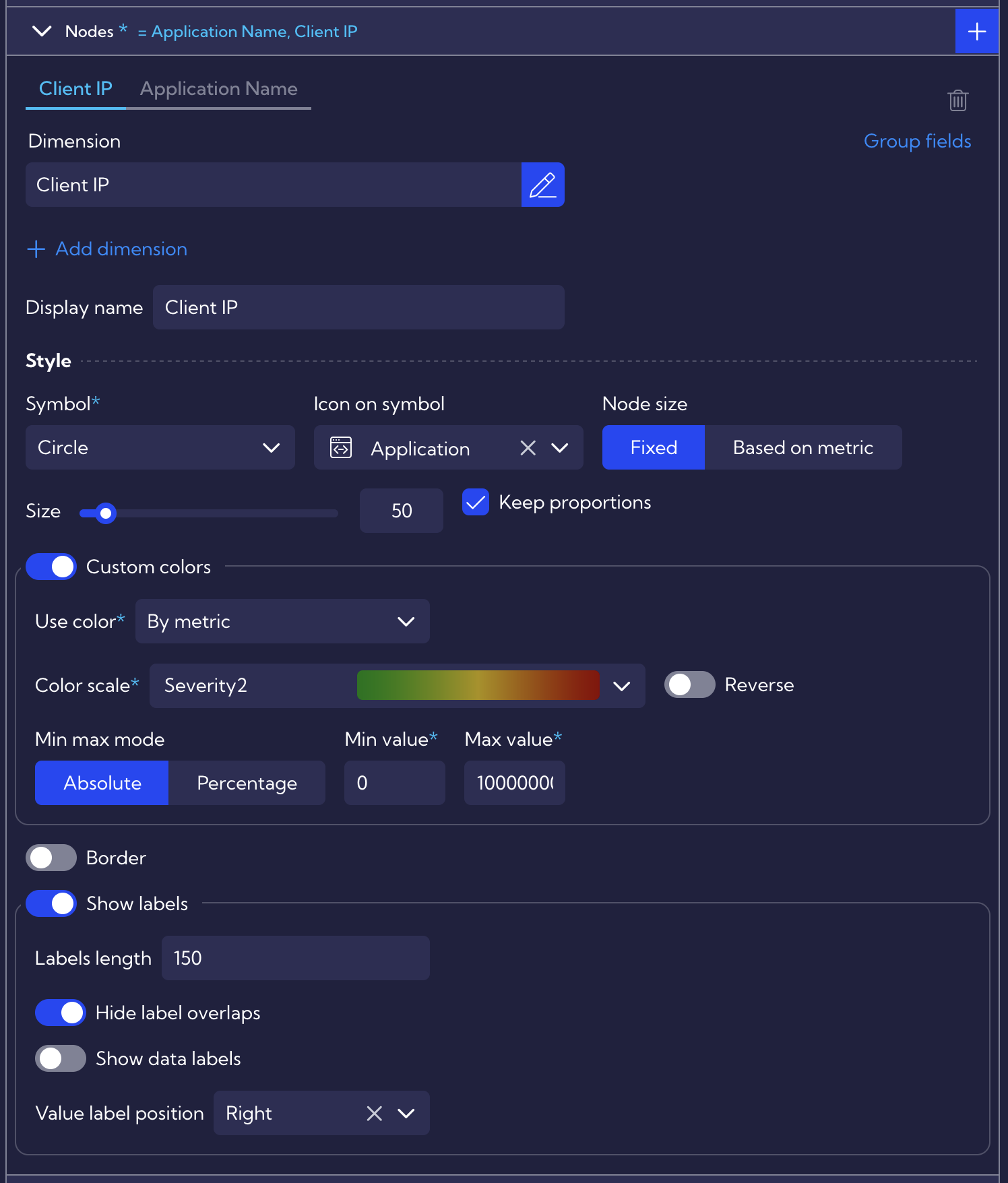
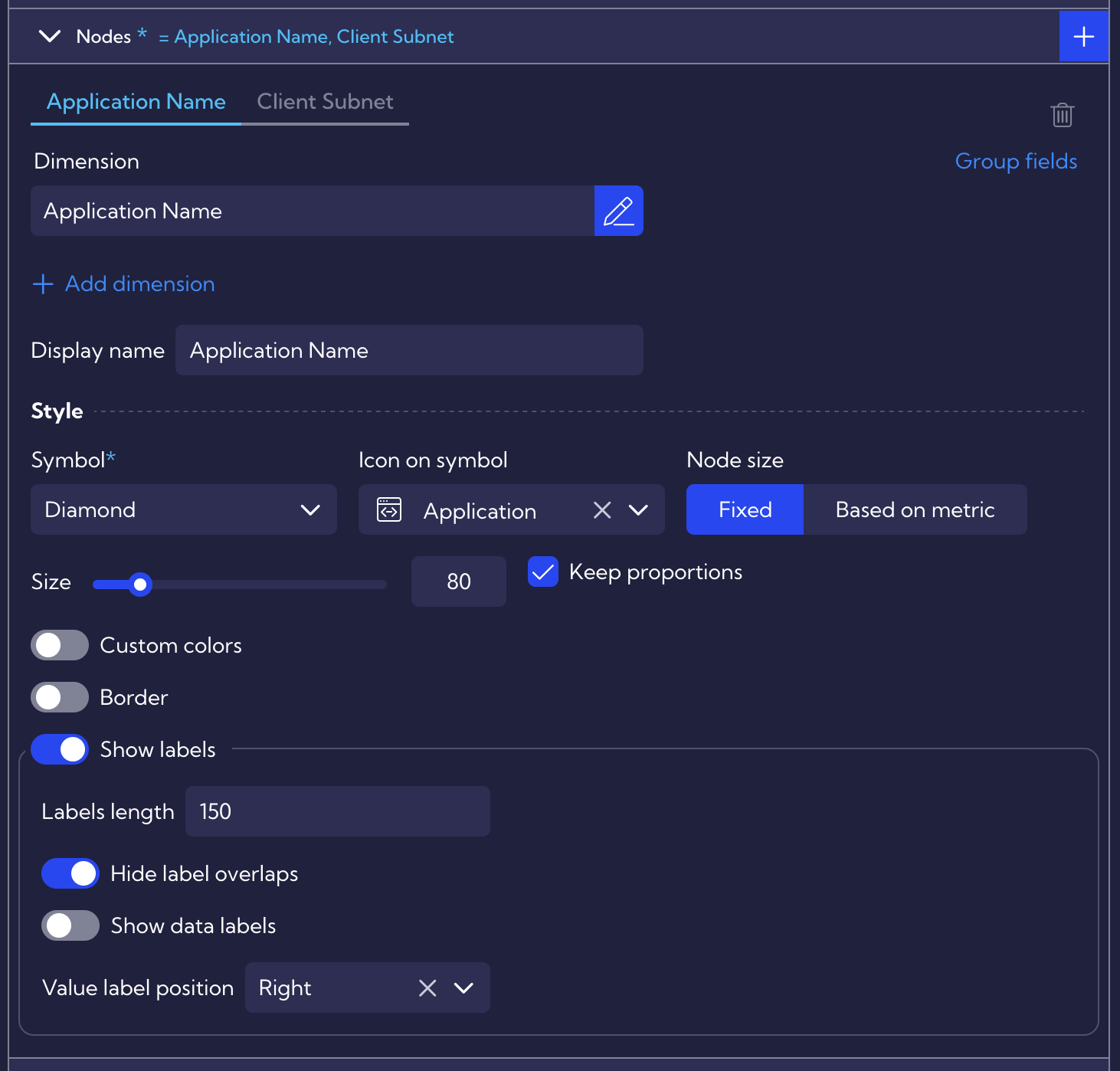
Node Configuration
Nodes (graph objects) in this example use Client IP and Application Name. A “Custom Color” threshold is applied with the following settings:
- Absolute Value – threshold of 100000000 (100 Mbit/s); value 1000000000 would represent 1 Gbits/s.
- Dynamic Coloring – automatically adjusts link and icon colors based on SQL server network interface utilization.
- Node Size – can also be configured dynamically based on metric values. When using Percentage for Custom Colors, the scale is calculated automatically, which is recommended when the exact thresholds are unknown.
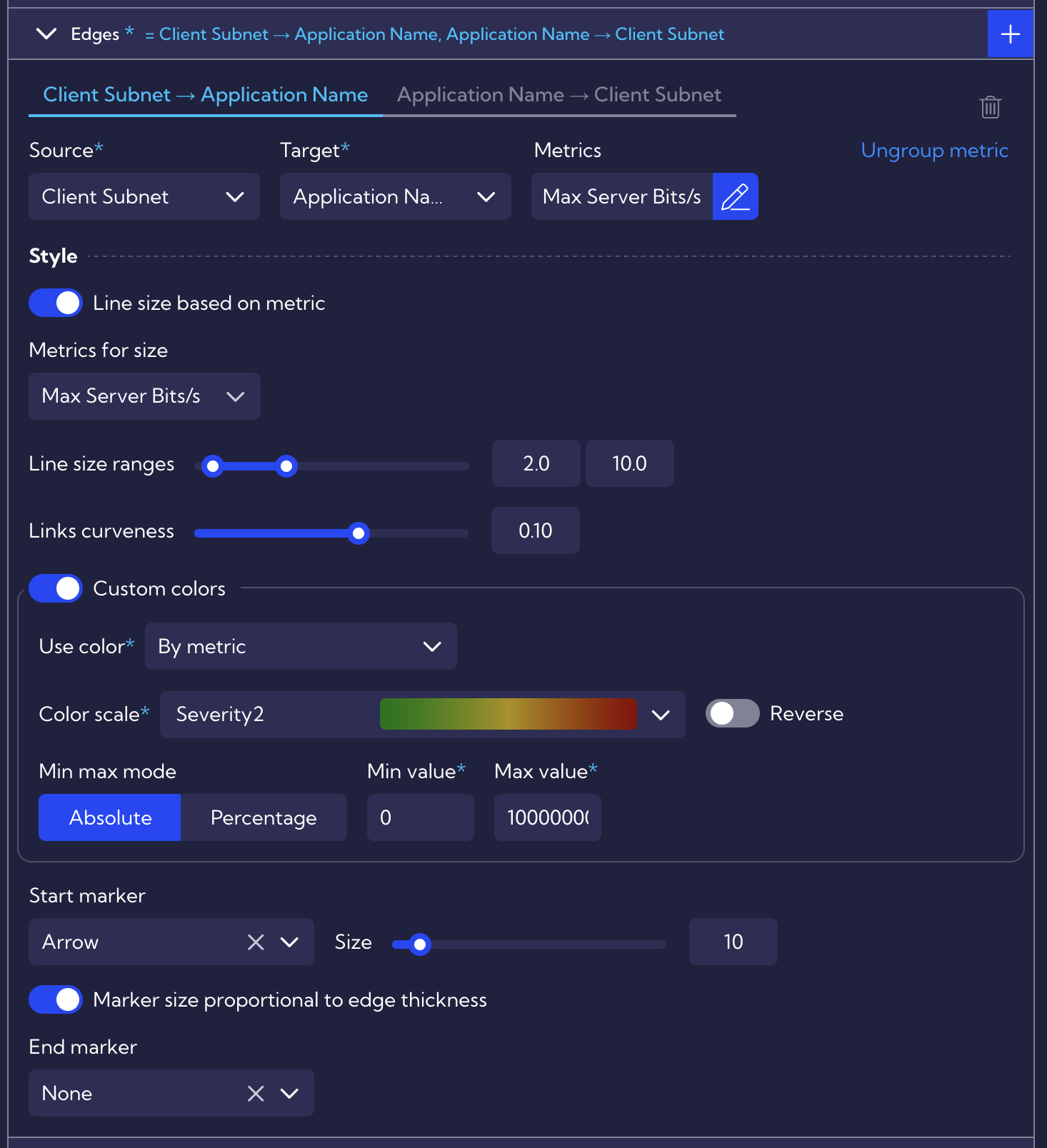
Edge Configuration
Edges (lines between nodes) require both Source and Target values, derived from the selected nodes. Metrics define the statistical values displayed on edges.
Additional configuration options include:
- Line size – based on the metric value.
- Curvature – separates multiple edges for readability and avoiding overlapping certain situations (e.g., changing curvature from 0.10 to -0.10).
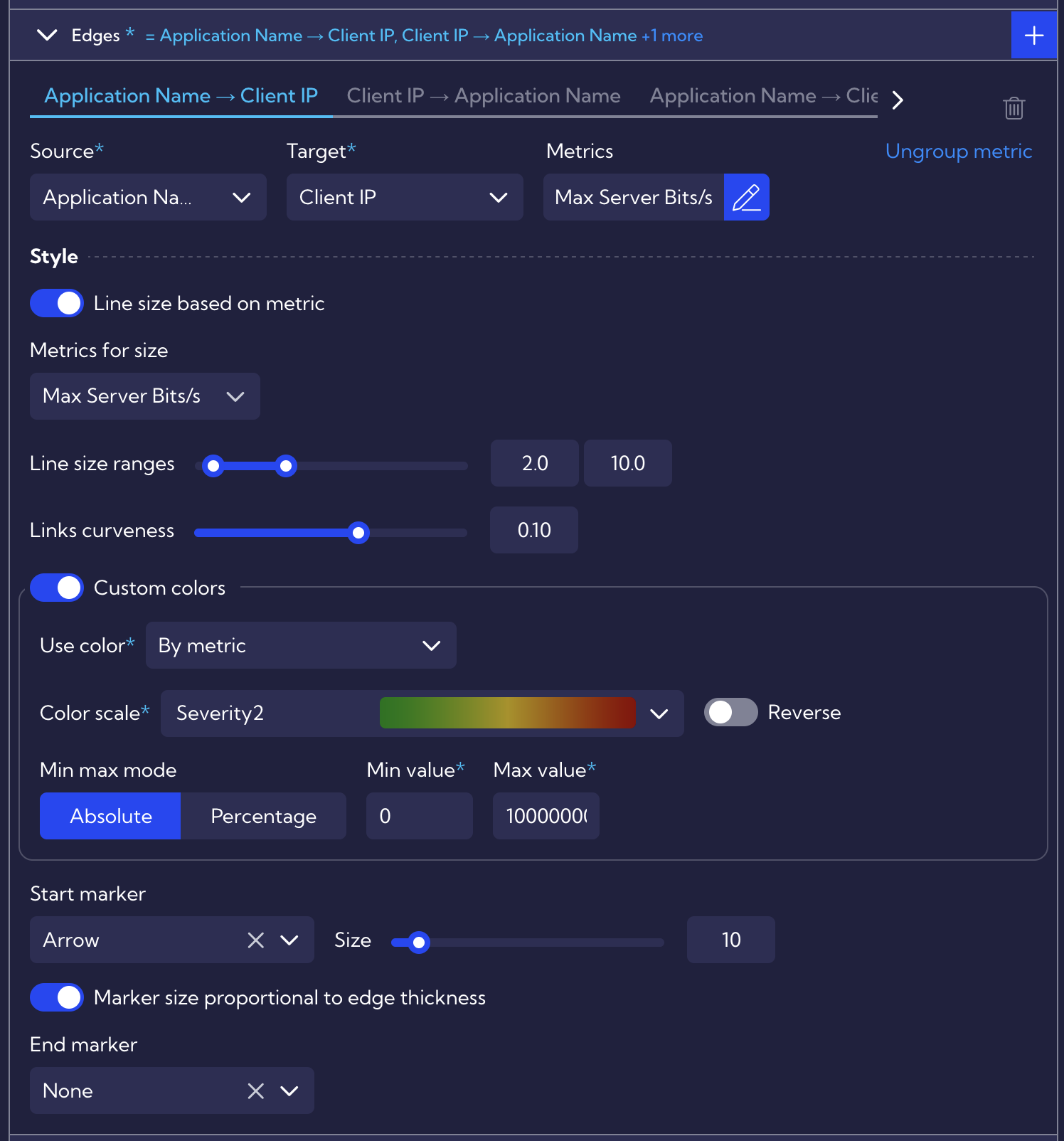
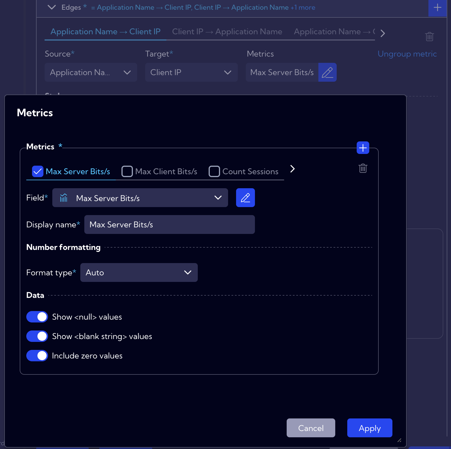
Metrics have a separate definition list within the Edges function. Users can define multiple metrics as needed, and for each specific edge definition, a desired metric can be selected and edited from this list. It is important to note that the list is shared across all edge definitions - removing a metric will also remove it from every edge where it is applied.
Additional Options
In the Options tab, further settings are available:
- Limit – ensures browser performance by restricting output records.
- No Data – custom message if no statistics are available (e.g., due to filters).
- Drilldown – enables navigation to dashboards or widgets from the graph.
- Privacy – controls permissions for specific user groups.
- Style – allows selection of background color or image (JPEG/PNG up to 100kB), with transparency and border customization.
- Other Options – additional layout adjustments such as:
- Layout (Force or Circular) – example below
- Repulsion (distance between nodes)
- Gravity (central alignment of nodes)
- Edge Length (distance between connected nodes)
- Friction (controls node movement during animations)
| Force | Circular |
|---|---|
 |  |
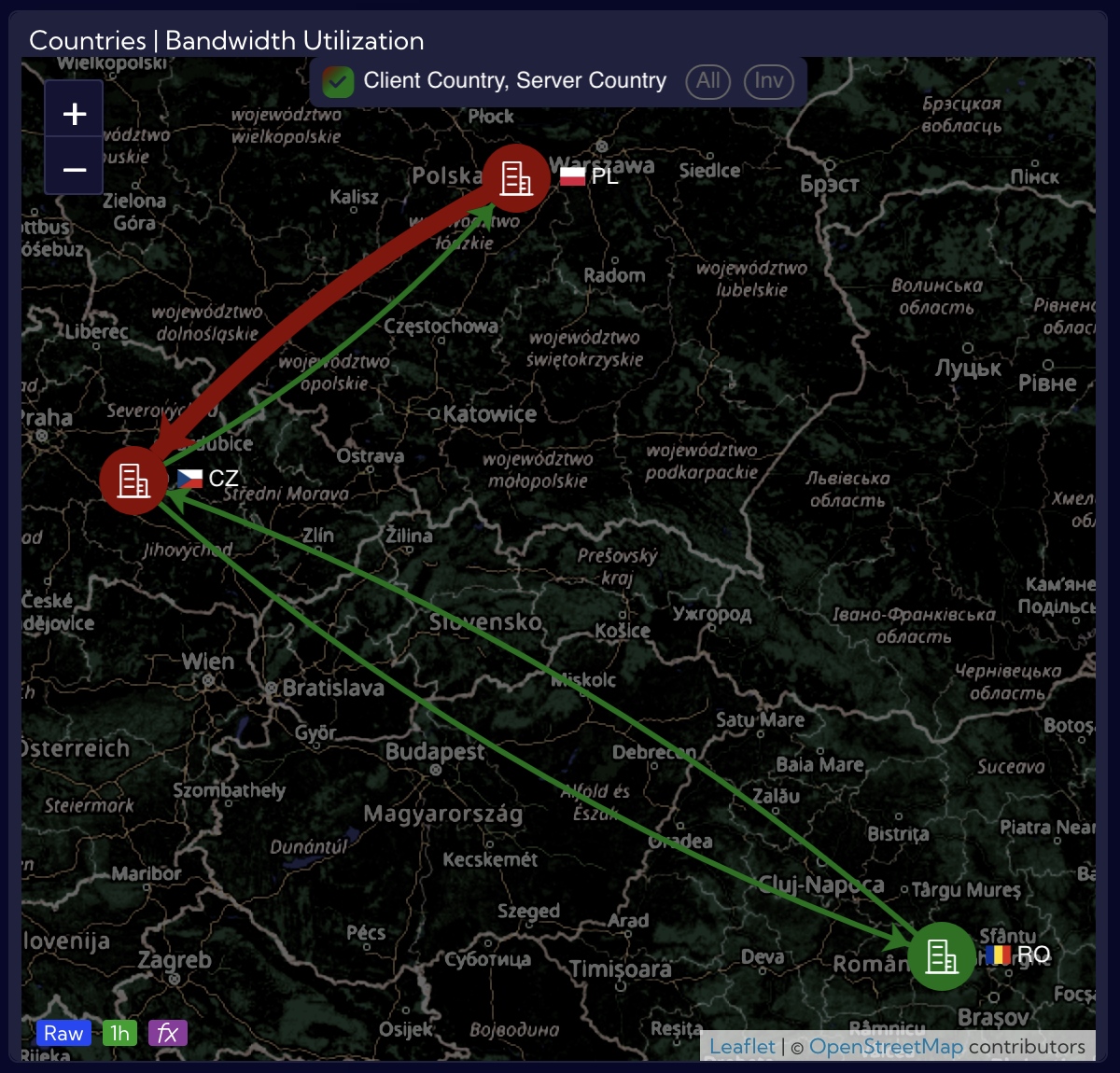
Example: Network Utilization Between Applications and Subnets
The following graph visualizes 1 Gbit/s bandwidth utilization between applications and subnets. These elements can be defined either through Quick Setup or by using the groups-app and Hosts & Subnets lookups.
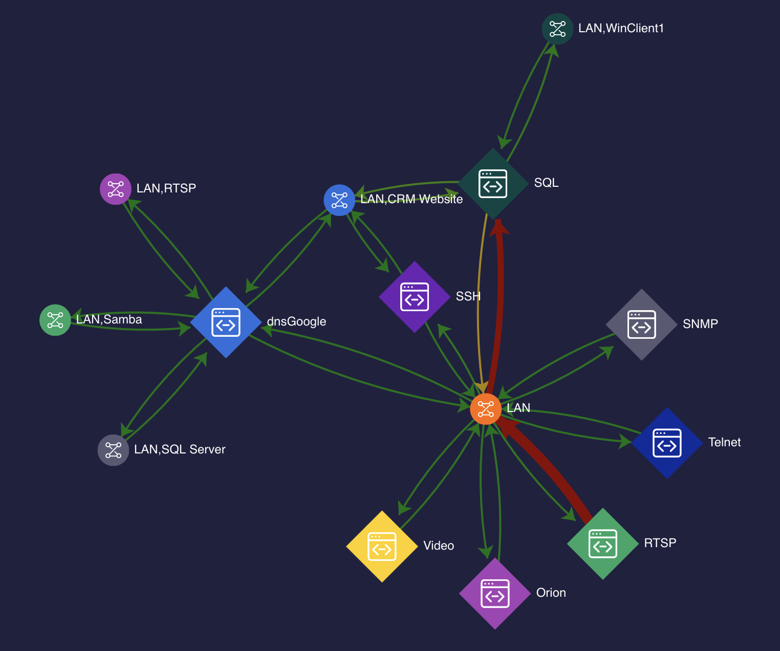
It enables quick identification of traffic saturation. In the example, RTSP traffic exceeds 270 Mbit/s in a LAN subnet and is highlighted in red.
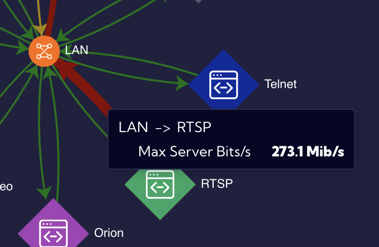
This visualization uses a netflow stream with the following configuration: • Nodes – defined as Applications and Subnets. • Edges – metrics “Max Server Bits/s” and “Max Client Bits/s,” highlighting utilization peaks and potential bottlenecks.
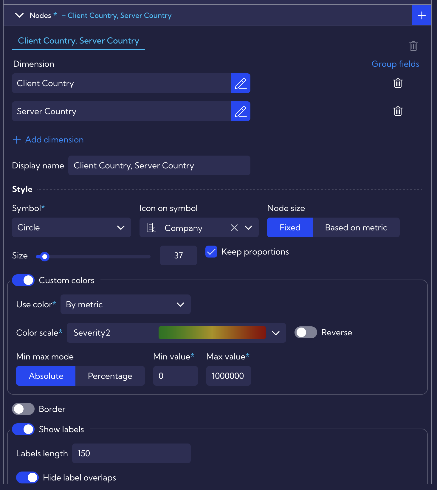
Example: Graph on map
A Graph on map can be used to visualize traffic between countries. In the example below, edges represent Max Client Bits/s between offices in three countries. The Hosts & Subnets lookup assigns assets to countries, ensuring accurate grouping.
In graph visualizations, relationships are typically represented in terms of clients and servers. The same principle applies when working with countries, where grouping can be based on Client Country and Server Country. However, when using the Graph on map widget, both dimensions should be defined within a single node configuration to prevent duplicate objects from appearing on the map.
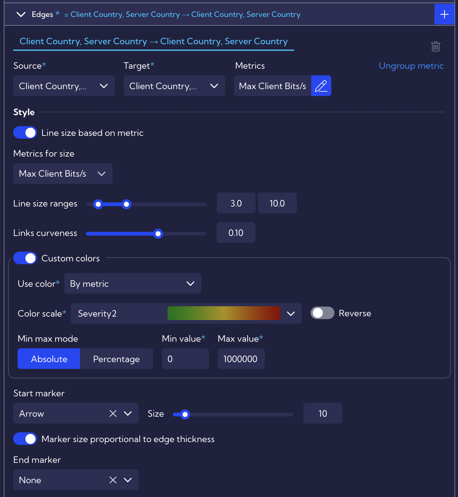
Because two dimensions were applied within a single node entry, the same approach must be used for the edge configuration. A single link definition, combined with the selected metrics, is sufficient to produce the example shown above.
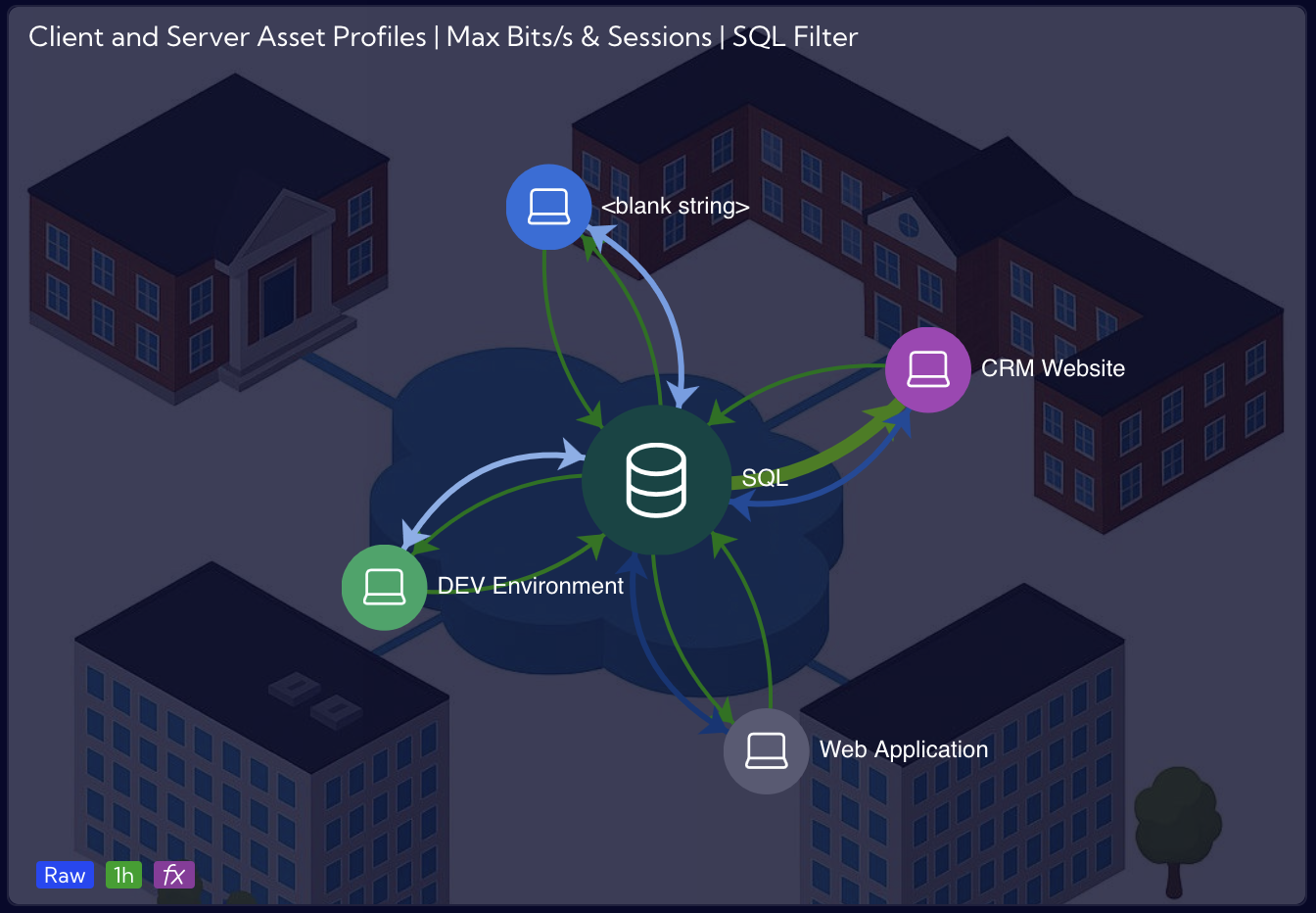
Example: Profiles and Traffic Rule Correlation
As highlighted in the previous example, traffic between objects is typically divided into clients and servers. The following use case demonstrates an alternative approach. In Sycope, all saved applications are defined as servers. To present traffic between a Web Application server and an SQL server, Traffic Rule Profiles can be used. Graphs allow these profiles to be interconnected and correlated with the NetFlow stream, enabling the visualization of key statistics such as bandwidth (bits/s), sessions, and more.
Example for visualizing traffic between SQL, Web Application and Cloud Management profiles:
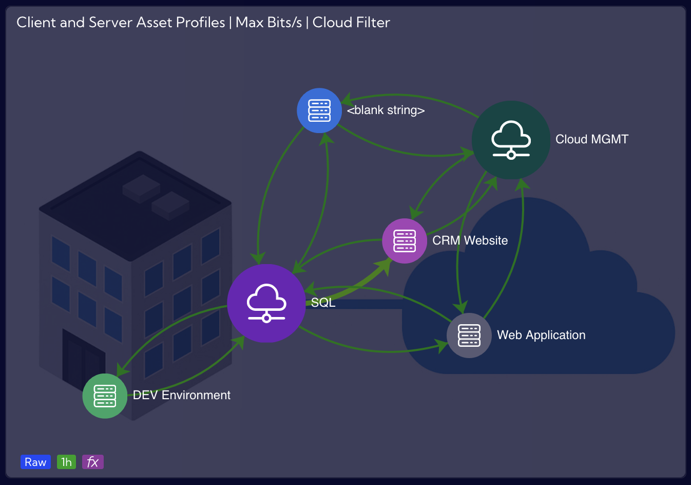
As shown in the screenshot below, the NetFlow stream is selected, and both profiles are defined in the filters as Server Profiles. This configuration ensures that the graph displays all connected client profiles within the Traffic Rule Profiles. If required, users can further refine the view by filtering specific Client Profile values.
Aside from this adjustment, all other node and edge configurations remain the same as in the first example. The additional example of profiles in Graphs is very similar, with the difference that the filters specify only the SQL profile as the Server Profile. In both cases, a custom background image is applied.