Limit Series
The Limit Series function is used to display only the top values in a dataset based on a chosen metric.
In the presented dashboard, it is applied to netflow data, showing only the top 10 server ports and top 10 server IPs based on traffic volume.
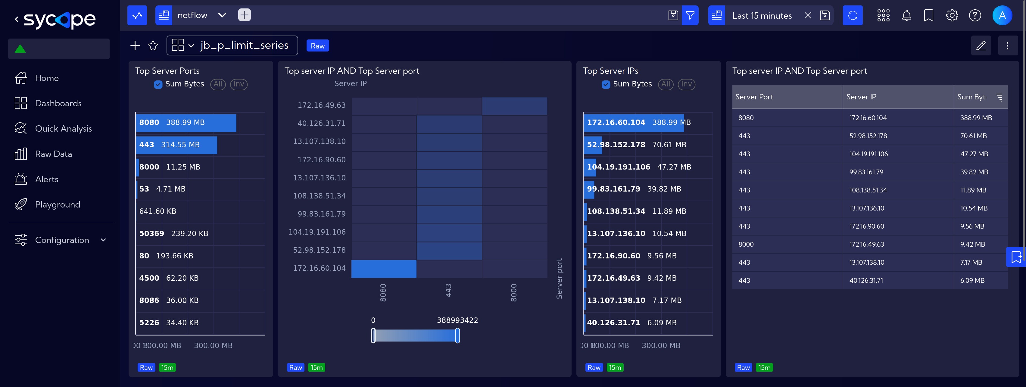
Using the Top Server Ports widget as an example, let's go through the settings.
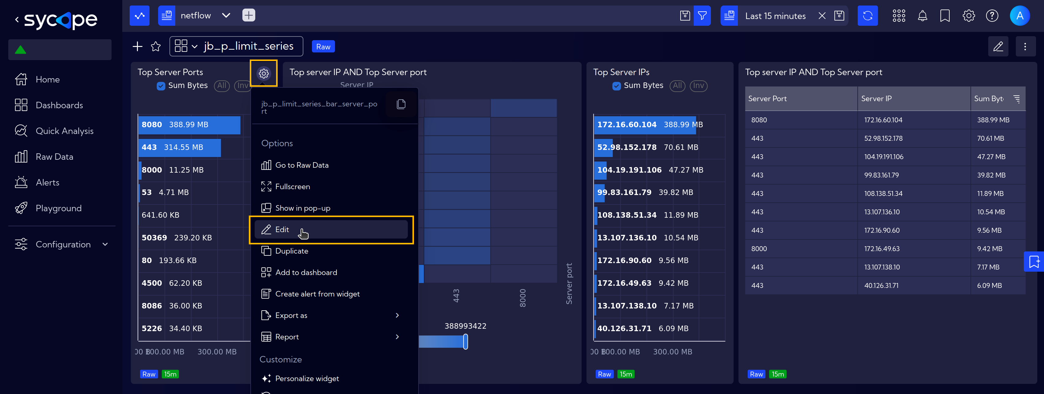
First, open the widget settings and navigate to the Data tab.
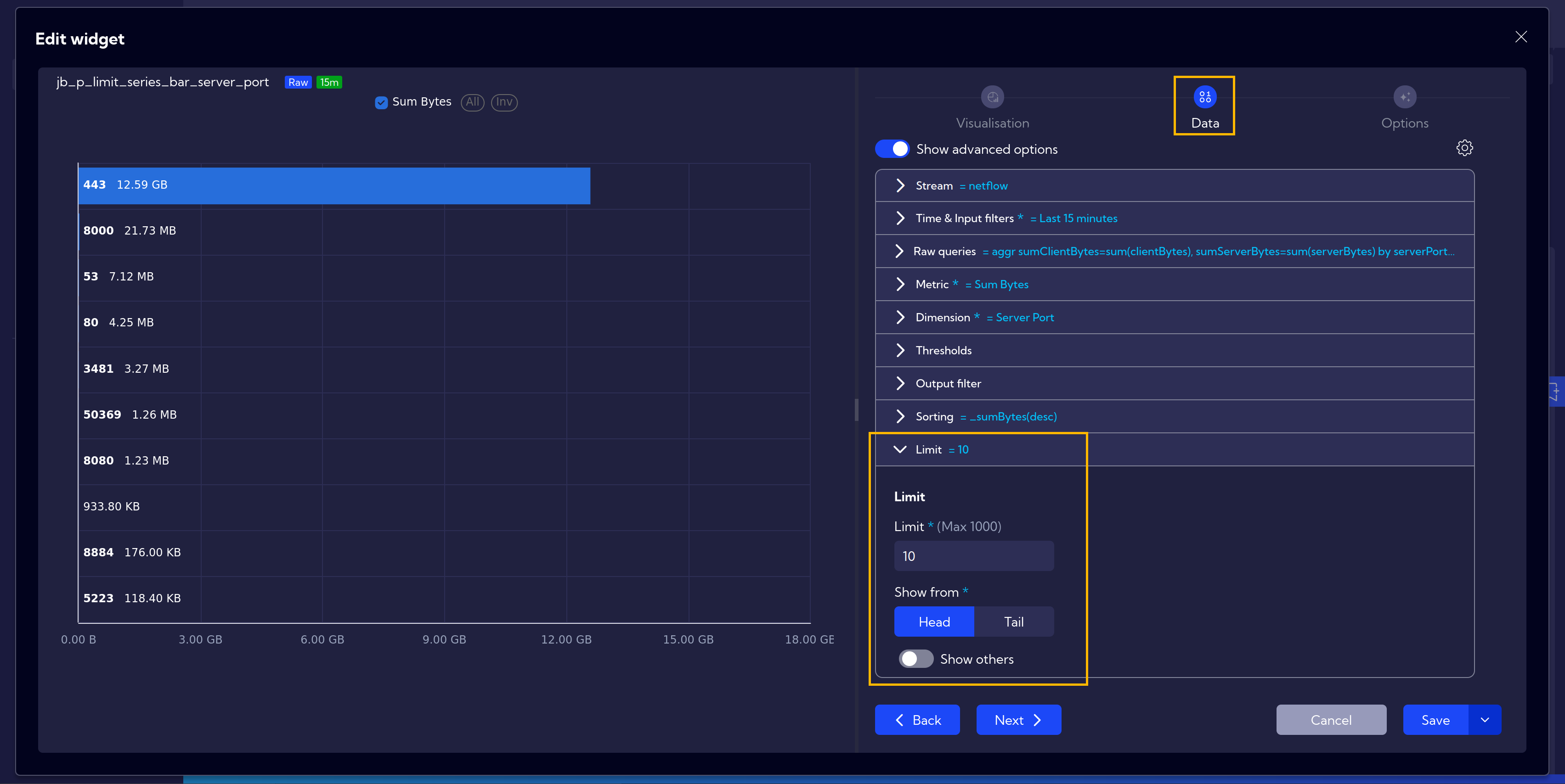
After configuring all the necessary settings, i.e. Sum Bytes as Metric, Server Port as Dimension and desired Sorting options, scroll down to the last expander, where you can set the Limit. Additionally, you can choose whether to display the first entries (head) or the last entries (tail) in the table.
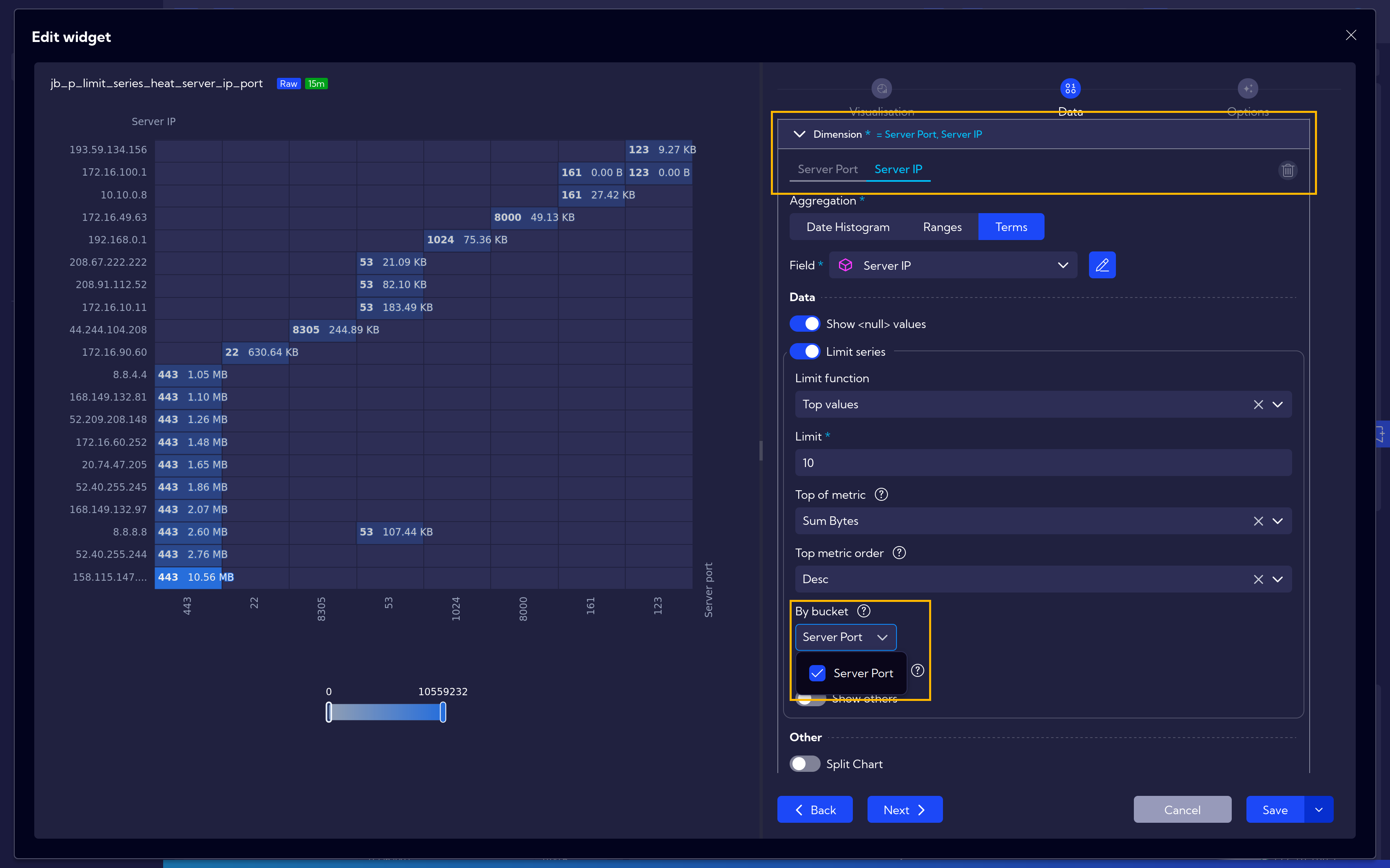
By Bucket
The default limits work in such a way that we have separate top 10 IPs and separate top 10 ports. As seen on the heatmap, not necessarily all top 10 IPs connected to all top 10 ports.
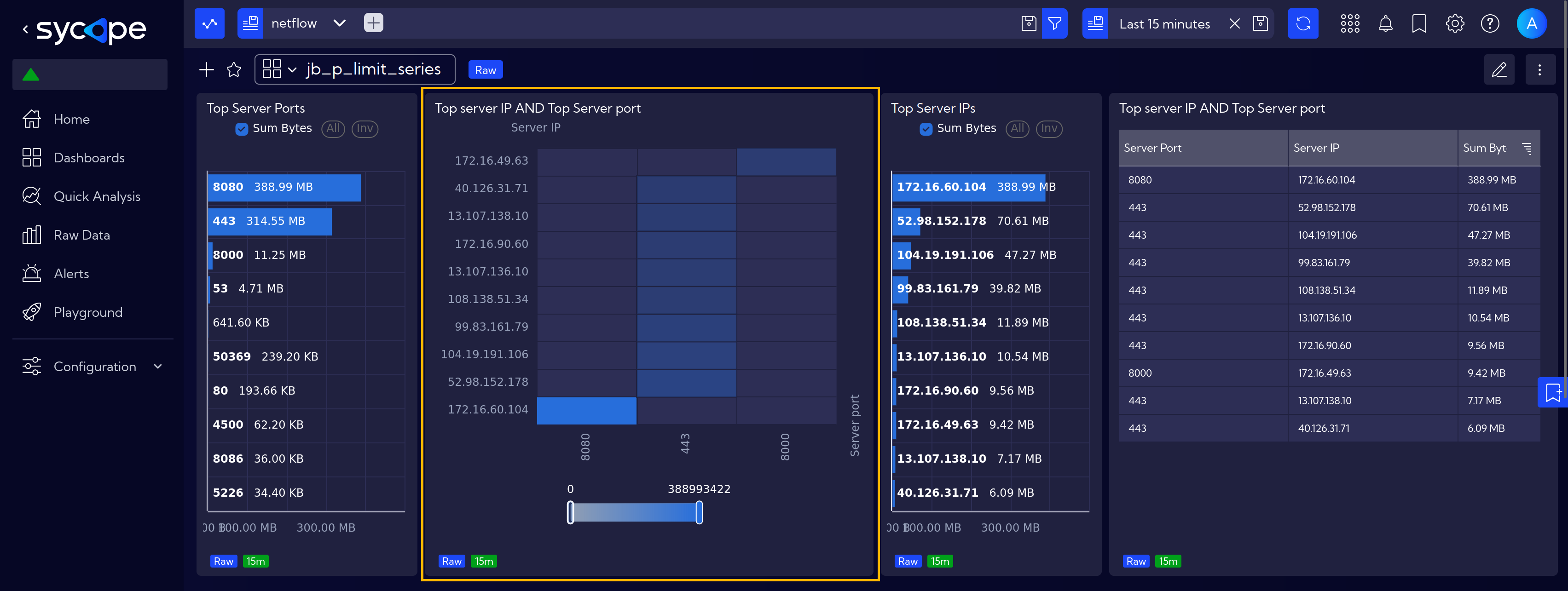
To address this issue, there is an additional option called By bucket, which allows to show the top 10 IPs and, for each of them, the top 10 ports.
Go to the widget options and in Data section, in Dimension expander, locate the Server IP value and modify the limit calculation method. Use By Bucket option and select there Server Port.
This adjustment ensures that for each Server IP, the top 10 server ports are visualized.